


How nineteenth century zoological societies, curiosity cabinets, and scientific collections inspired the DB Clariday™ family of typefaces
In the spring of 2018, I was invited to tour the private scientific collections of the California Academy of Sciences as part of a typeface design collaboration. Situated in San Francisco’s Golden Gate Park, the Academy is one of the largest museums of natural history in the world, housing over forty-six million specimens. The Academy was established in 1853 as a learned society and still carries out significant original research. Its goal for inviting a group of designers to tour its private collections was to provide inspiration for new typeface designs based on the field notes, labels, and books found in the archives. This was a win-win situation I couldn’t pass up: celebrating the typefaces inspired by the collections as well as the process of their creation introduces the Academy to a fresh, design-centric audience.

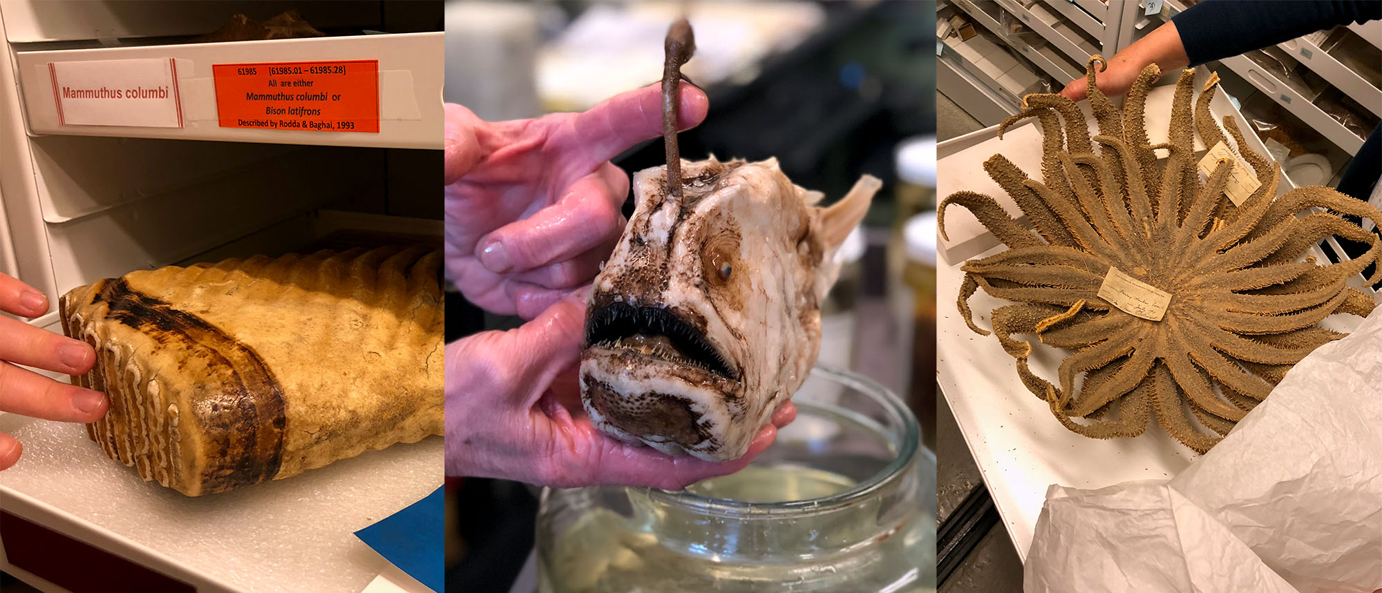
Over the course of the week I spent at the Academy, I visited the full range of specimen collections, from botany to geology, anthropology to herpetology (the study of reptiles), mammalogy to ichthyology (the study of fish). Each department was a trove of inspiration that came with a collections guide: an Academy expert on the specific room’s contents. The specimens occupied a variety of spaces hidden away from public view, from windowless chambers filled with books to all-white, climate-controlled rooms with vaulted ceilings containing aisles of cabinets whose drawer handles begged to be pulled.
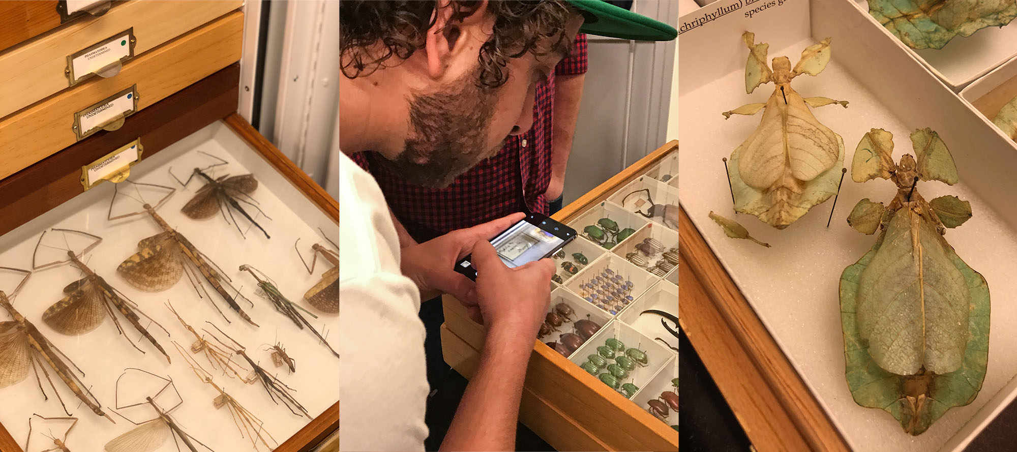
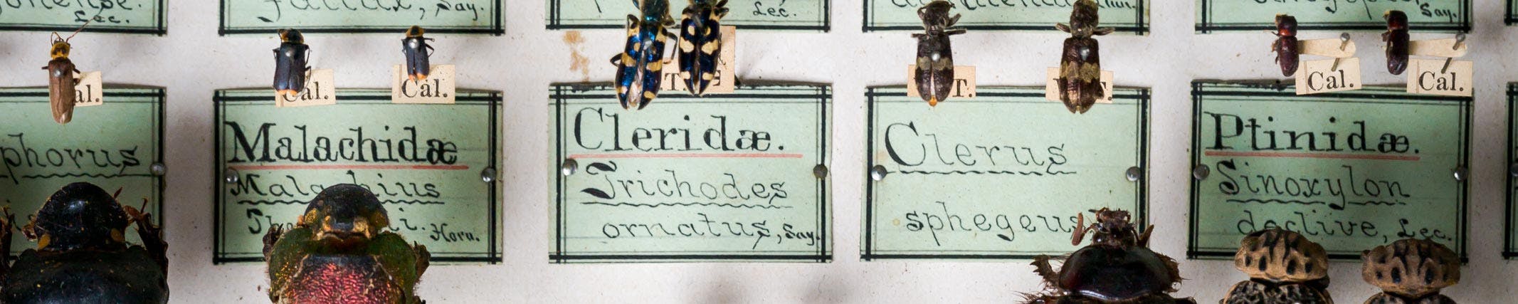
The department that most stood out to me visually and typographically was Entomology, concerned with the study of insects. The scientific community has classified over 1.3 million insect species, which is over two-thirds of all known species on Earth. Insects come in an incredible range of sizes and colors that have evolved to suit the various species’ environmental needs perfectly. Though not always visible or equipped with an obvious purpose, this branch of the animal kingdom is vital to the survival of both humans and other forms of life. It was in the Entomology Department that I had an epiphany about the overlap in evolution between letters and insects. Each exists in countless varieties, shaped by their environments to perform optimally a certain function in a certain context.
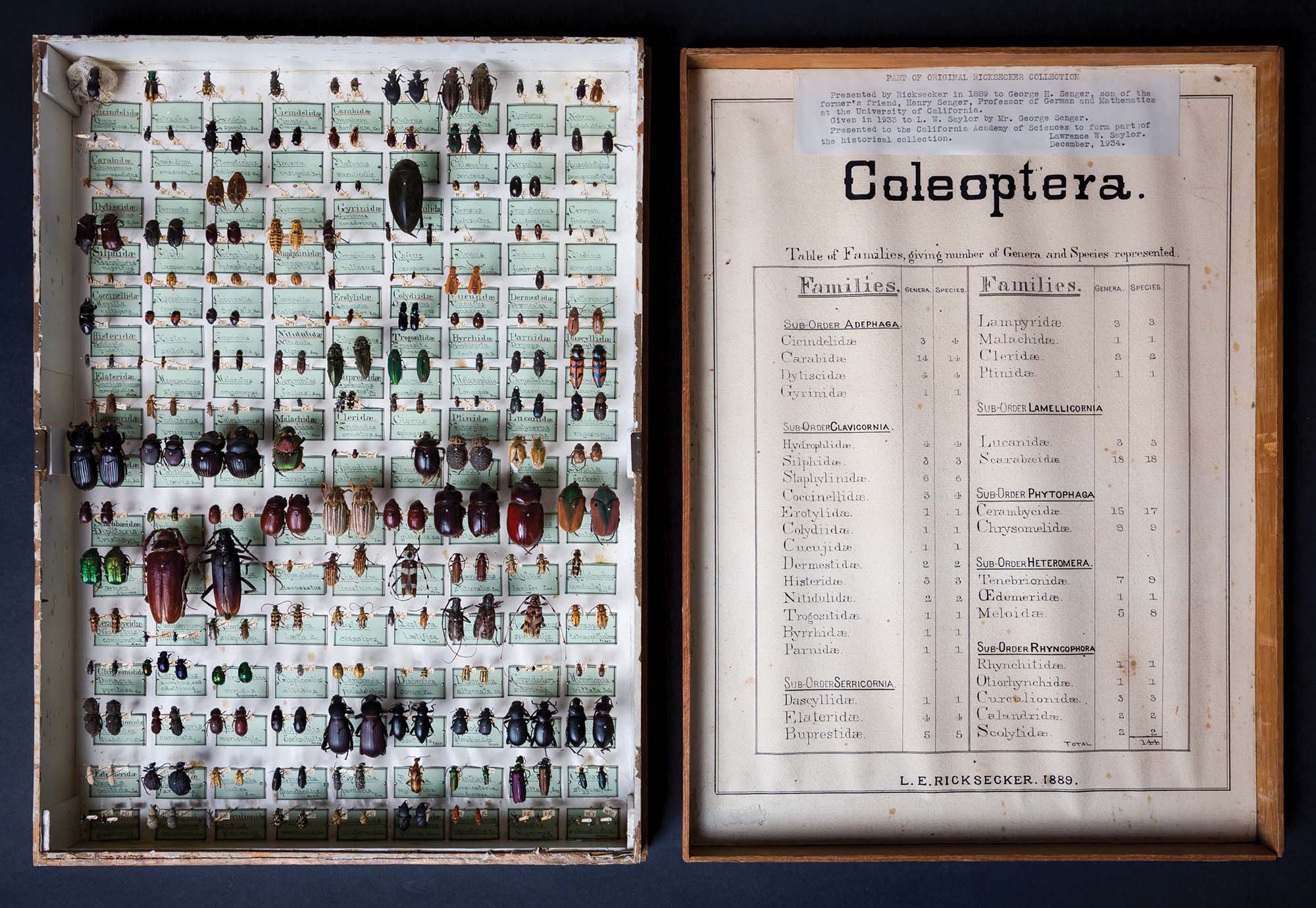
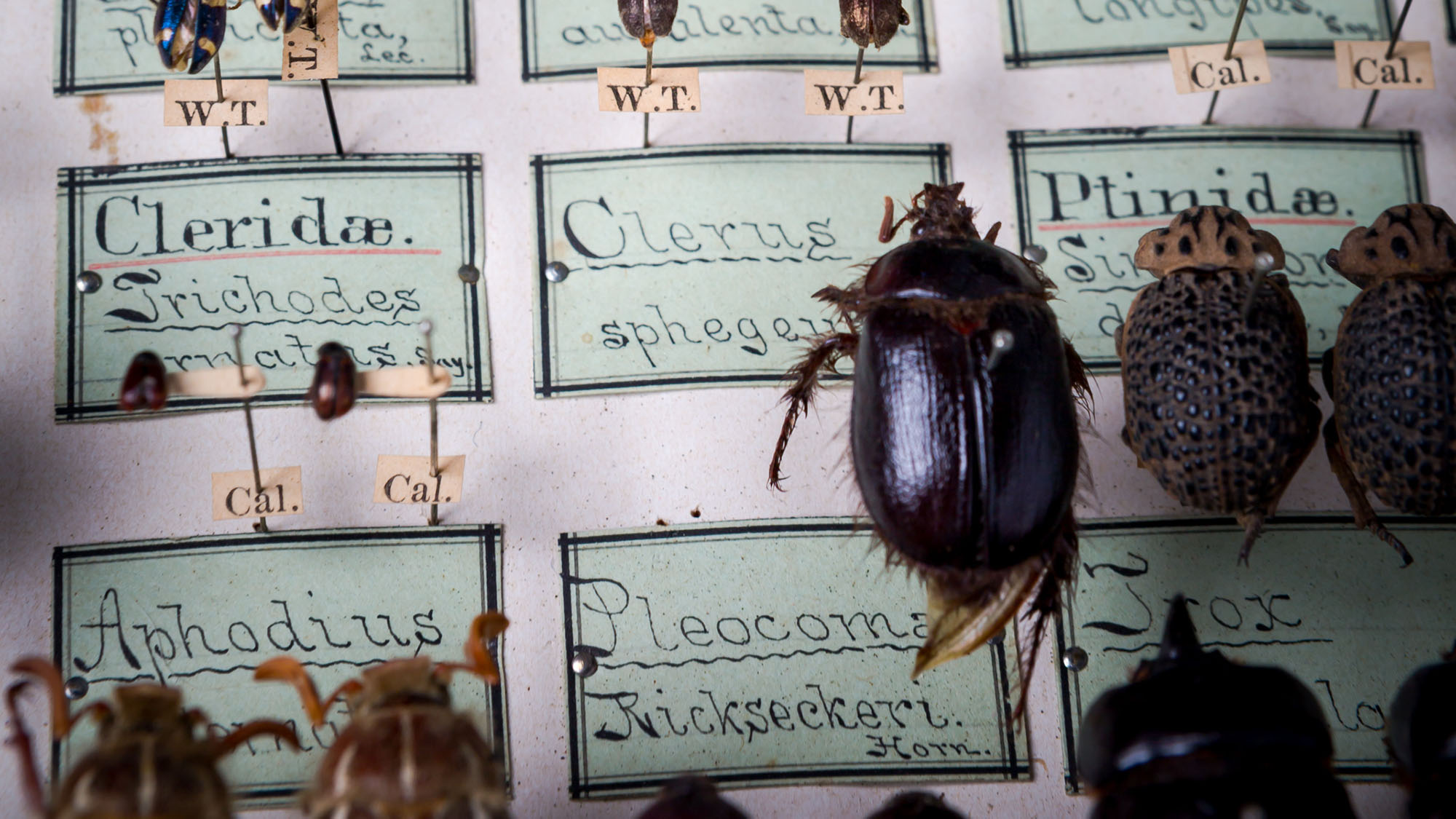
A particular specimen among the vast shelves full of every color in the rainbow caught my eye. I later learned that this piece I was so enamored of is known as a curiosity cabinet. The cabinet was beautiful, with two sides. One side was full of gorgeous insect specimens pinned over meticulous hand-lettered labels; the opposite side housed an extensive table explaining the insect order of beetles, or Coleoptera. The box was originally given as a gift from avid Coleoptera collector L. E. Ricksecker to the son of Ricksecker’s friend Henry Senger in 1880. In 1934, the California Academy of Sciences was granted possession of the cabinet via Lawrence Saylor as a contribution to the Academy’s historical collection. Each individual beetle specimen was beautiful, and the accompanying letters intrigued me. Three distinct styles of hand-drawn letters lived side by side in this single curiosity cabinet.
The cabinet by Ricksecker reminded me of dioramas and assemblage art—everything has its place, everything in its place. Specifically, I was reminded of Joseph Cornell, a self-taught American visual artist and filmmaker who pioneered the art of assemblage, arranging eclectic specimens of photos and knickknacks in glass-pane shadow boxes. Cornell’s collages were multifaceted in their influence, a visually simple constructivist take mixed with the fantastical compositions of surrealism. An interesting fact about his assemblage work is that despite its “worldly” air, Cornell almost never left his home state of New York. The Ricksecker curiosity cabinet, to me, feels like a precursor to Cornell’s assemblage work, as if Cornell somehow time-traveled back to art-direct the process of constructing Ricksecker’s gift. This celebration of Coleoptera hints at both constructivism and surrealism; I find the similarity fascinating!
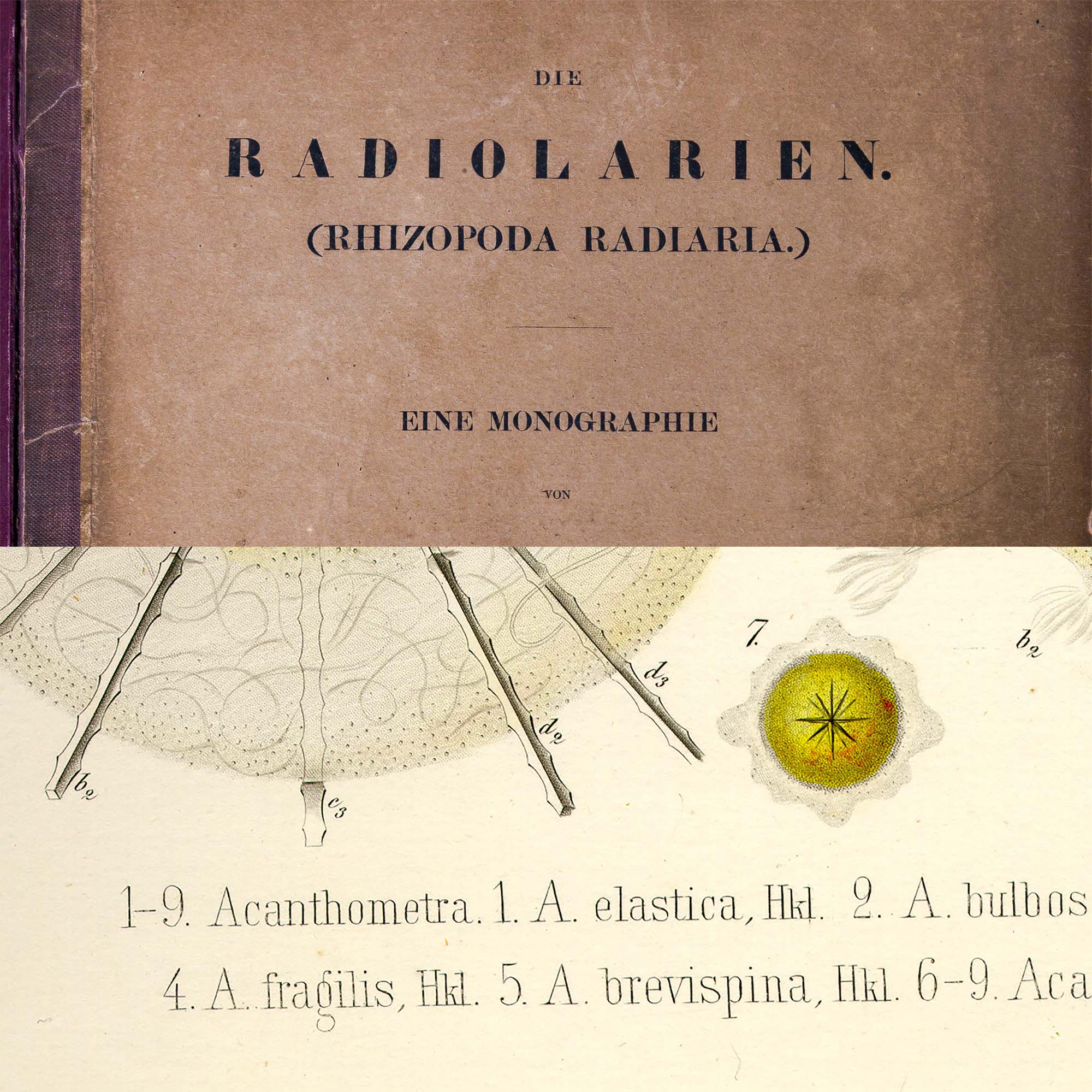
Although the entomology specimen collection provided ample inspiration, my search did not stop there. I was hot on the trail of something fresh. Later in the week, a visit to a different department unexpectedly revealed a connection to the lettering styles found in Ricksecker’s curiosity cabinet. The geology collection had a small side room filled with books related to the study of the solid bits of our Earth. Shelves and stacks of field notes and giant tomes of research loomed everywhere. During my rummaging and reading, I stumbled on a book called RADIOLARIAN etc.* Radiolaria are ocean-dwelling protozoa (single-cell organisms) that produce intricate mineral skeletons. Marvels of evolutionary design, the skeletons come in fascinating shapes and configurations. I fell in love with the geometry of the skeletons in the book; then I noticed that the illustrated specimens were annotated with thin monoweight condensed slab serif lettering. RADIOLARIAN was published in 1862 by German scientists in Berlin, less than twenty years before Ricksecker’s cabinet construction—a similar time frame for a similar lettering style produced 5,600 miles away.
As the Academy collections tours continued, the childhood Dave in me was thrilled every time we walked into a new vault of colors, textures, and sights. Some of my favorite childhood memories linger in the Boston Museum of Science and the New England Aquarium. CAS combines both of these childhood loves, and exploring the Academy allowed me to rekindle that feeling of wonder while also being a researcher myself.
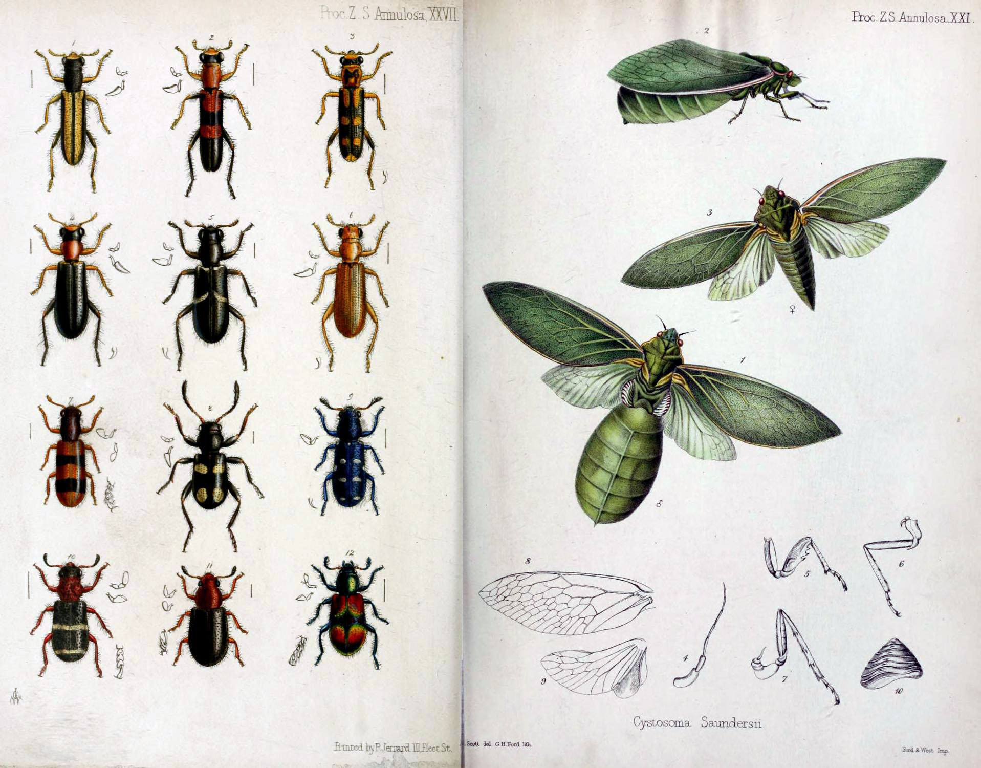
Following my visit, my research into late-nineteenth-century scientists’ usage of condensed slab styles of letters continued. I consulted online library resources in search of more documentation of specimens from the same general time frame as the Ricksecker and RADIOLARIAN examples. After perusing various websites, I ended up checking the reference section of the Wikipedia entry on Cleridae, where I found an image plate from the Proceedings of the Zoological Society of London. The plate consisted of twelve species of checkered beetles (Cleridae family) in striking vibrant colors and styles, but even more intriguing were the typographic notes in an efficient monoweight slab serif, neatly tucked away in the corners. Going back online, I was able to find a scanned copy of this annual from a library in the UK, which turned out to have a publishing date of 1851—not far off from Ricksecker’s lettering or the RADIOLARIAN image-plate notations.


I had found three different sources from three different countries and three different authors, all originating in the late nineteenth century. It was an exciting cluster of inspiration for me to absorb, along with the hundreds of photos I captured while touring the Academy’s extensive specimen collections. My process began with drawing lettering pieces based on standout specimens found during my visit. I was most attracted to the thin-faced Clarendons and the backslanted script.

The Clarendon typeface, released in 1845 by Thorowgood and Besley of London, was not exactly pioneering but was popular enough to jump-start an entire genre of slab serifs with increased contrast between thicks and thins. It is suggested that the inspiration for the evolution of the slab serifs into the bracketed and contrasting Clarendons came from nineteenth-century capitals hand-lettered by copperplate engravers. A genre rooted in the earliest slab serif examples of Vincent Figgins’s foundry would evolve into a variety of Clarendons, from display-centric thin faces and fat faces to more sturdy regular and expanded styles.
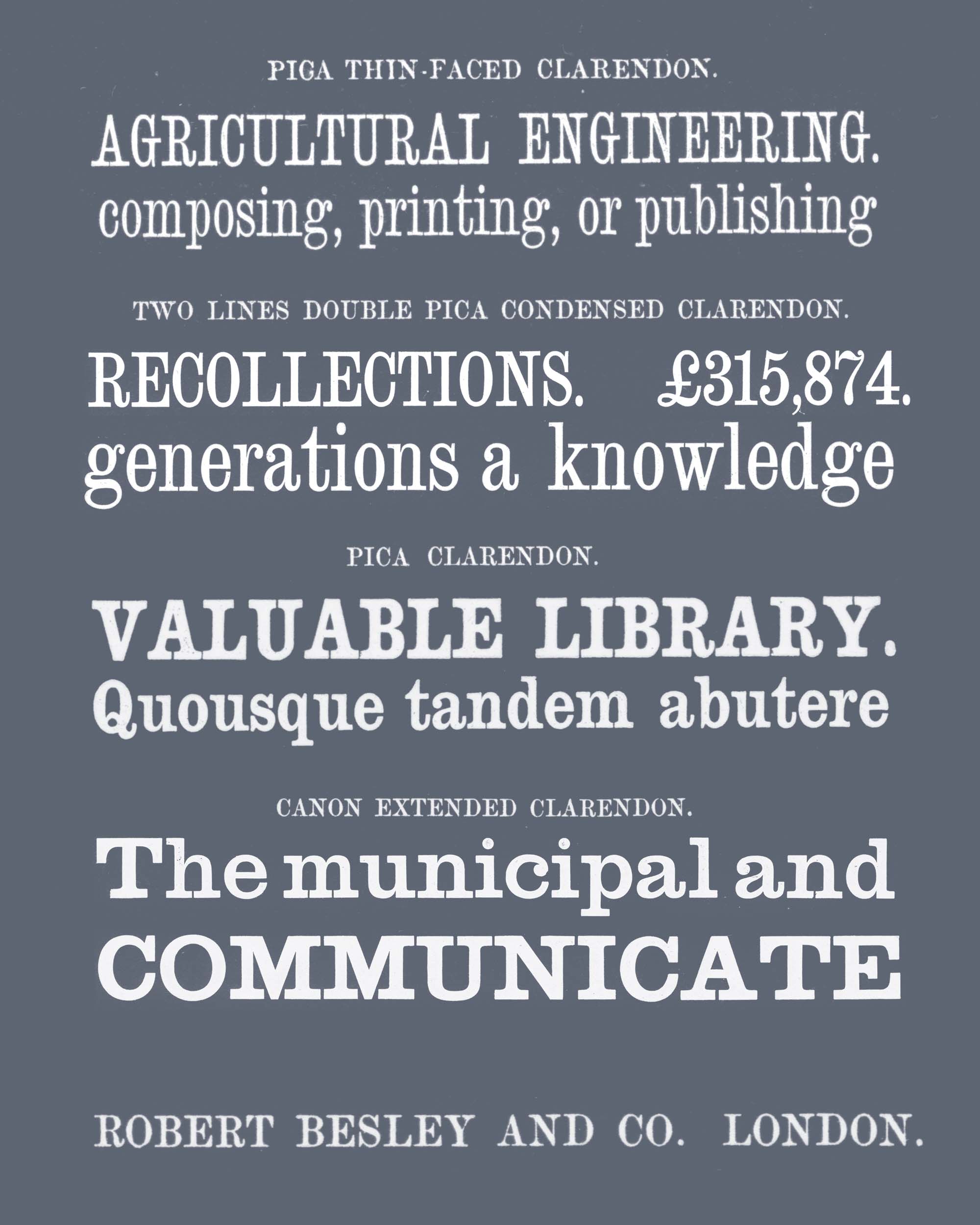
The various styles that evolved are in line with Besley’s original intentions with his cut of Clarendon in 1845, bucking the trend of wide slab serifs to design a horizontally efficient typeface that not only served a traditional Clarendon display role, but also functioned as a heavier style within running text. Besley felt that a bold face would create a more striking emphasis in a block of text, rather than the italic forms that have been used toward that end for hundreds of years. Typical body-text typefaces of the period were fairly compressed in their design; thus, Besley reasoned, Clarendon’s less typical compressed slab proportions would double its functionality for display and text. This gave me pause. Though I was initially attracted to the curiosity-cabinet modern calligraphy and groovy backslants, there appeared to be more functional DNA in the skeleton of the pieces I found in the RADIOLARIAN book and the Zoological Society’s proceedings.
The name “Clariday” was inspired by Ricksecker’s beautiful curiosity-cabinet calligraphy. Inside the cover of the Coleoptera box is a list of the subfamilies and orders of beetles, including Cleridae, commonly known as checkered beetles. I found the name charming, though I decided that it would be smart to adjust it slightly to something unique and easier to spell.
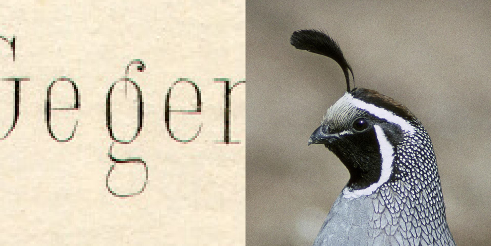
By transposing the quirks of the various samples into an amalgamated design, I gave Clariday’s styles a unique voice while keeping them connected via their shared skeleton. My goal was to evolve the essence of the found letters while incorporating sparkly idiosyncrasies from the different sources of inspiration. An example of this is the ear of g, present in the RADIOLARIAN book lettering, which aligns perfectly with the decorative tuft on a California quail’s head!

Besley’s ethos while designing the original Clarendon was to make its functionality multifaceted. I’ve designed the DB Clariday font family with similar intentions. Bold and striking at display sizes, DB Clariday Serif is a nod to the expressive curiosity-cabinet calligraphy I spied on the labels describing the Coleoptera. DB Clariday Slab and Sans extrapolate the core skeleton of DB Clariday Serif into robust forms suitable for longer text as well as emphasis, taking cues from letters in the Zoological Society of London’s Proceedings of 1851 and the German geology tome RADIOLARIAN. With some gentle tracking, the slab and sans designs find a comfortable rhythm at smaller sizes—you’ve been reading DB Clariday Slab this entire time!
A sincere thank you to Riley Cran, Laurel Allen, Kristina Fong, and the California Academy of Sciences collections managers and staff for this opportunity to collaborate. It has been a pleasure!